Colors have a special way of catching our attention and shaping our emotions. In online slot design, colors do more than make the screen look beautiful—they help create an atmosphere that draws players in and keeps the game fun. Every shade, hue, and tone serves a purpose, from building excitement to encouraging longer play sessions. Let’s explore how color theory becomes an invisible yet powerful part of every slot experience.
The Connection Between Colors and Emotions
Colors instantly influence how players feel. Warm tones like red, orange, and yellow often bring a sense of excitement and energy, while cool tones such as blue and green promote calmness and focus. In slot design, developers use these emotional responses to match the theme and tempo of a game. For example, a fast-paced adventure slot might feature fiery reds, while a tropical-themed one might rely on soothing greens and blues to create a relaxing feel.
Understanding this connection helps game developers build emotional balance. When players feel a connection through visuals, the overall experience becomes more enjoyable. It’s like the colors are setting the mood before the reels even start spinning.
The Psychology of Color Choices
Color psychology plays a big role in how players react to what they see on screen. Developers often choose specific colors to trigger certain feelings. Gold and yellow are often linked to wealth and success, making them perfect for jackpot animations or bonus rounds. Purple suggests creativity and luxury, while red gives a sense of urgency and excitement.
This thoughtful use of color helps guide a player’s attention naturally. For example, a glowing red “Spin” button instantly tells players where to focus, while a green “Collect” button signals safety and reward. Through these small but meaningful choices, color creates a natural flow throughout the game.
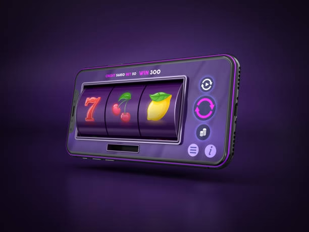
Building Themes with Color Harmony
A well-balanced color palette can bring a slot theme to life. Harmony in design doesn’t just make the game visually appealing—it strengthens the story the slot is trying to tell. A fantasy-themed slot might mix soft pastels and shimmering purples, while a classic fruit slot often sticks to bright reds, yellows, and greens for a nostalgic feel.
When colors complement one another, the screen feels inviting and smooth to the eyes. Too many contrasting tones can distract players, but harmonious combinations allow the visuals to feel connected and comfortable. This harmony keeps players focused on the reels without feeling overwhelmed.
Highlighting Wins and Bonuses Through Colors
Winning moments are the highlights of any slot experience, and color helps make them feel even more exciting. Bright flashes of gold, orange, and light blue often mark a win, instantly catching attention and creating joy. Bonus rounds may use glowing tones or sparkling animations to make the moment more memorable.
Developers also use gradients and lighting effects to create motion and energy. The way colors shift during a win sequence gives players a sense of reward and achievement. These visual cues make every spin feel more dynamic and satisfying.
The Role of Contrast in Visibility
Contrast plays a quiet yet important role in making slot visuals easy to understand. A proper balance between light and dark tones helps symbols stand out clearly. For instance, bright fruit icons against a dark background are easier to recognize and more appealing to the eye.
High contrast doesn’t just improve clarity—it builds rhythm. When the most important elements stand out, players can instantly spot buttons, payline markers, and bonus indicators without confusion. This simple but effective technique makes gameplay smooth and visually pleasant.
Using Color Gradients for Modern Appeal
Modern slots often use color gradients to bring depth and energy to the design. Instead of flat colors, gradients give a polished and modern appearance, making screens look more dynamic and full of motion. For example, a background that transitions from deep blue to violet can create a sense of richness and calm at the same time.
Gradients also allow developers to add highlights and shadows subtly, giving the illusion of texture and movement. This detail adds realism to 2D visuals and makes symbols appear more appealing, enhancing the player’s visual experience without distracting them.
Conclusion
Color theory is more than just a creative tool—it’s the foundation of slot design that shapes mood, builds excitement, and guides player experience. From subtle contrasts to vivid highlights, every shade contributes to making the game feel alive. Through thoughtful combinations and psychological understanding, colors transform ordinary visuals into memorable experiences. The next time the reels spin, it’s the harmony of colors working quietly in the background that makes the whole experience shine.