This new generation of dashboards goes far beyond visual appeal. The driving forces include AI-powered insights, real-time updates, immersive technologies, and accessible, ethical design—all of which ensure that stakeholders at every level extract meaningful understanding from complex datasets. As leaders seek competitive advantages, adopting these advancements is crucial, and resources like Nolan Rosen portfolio provide tangible inspiration for building intuitive, functional dashboards.
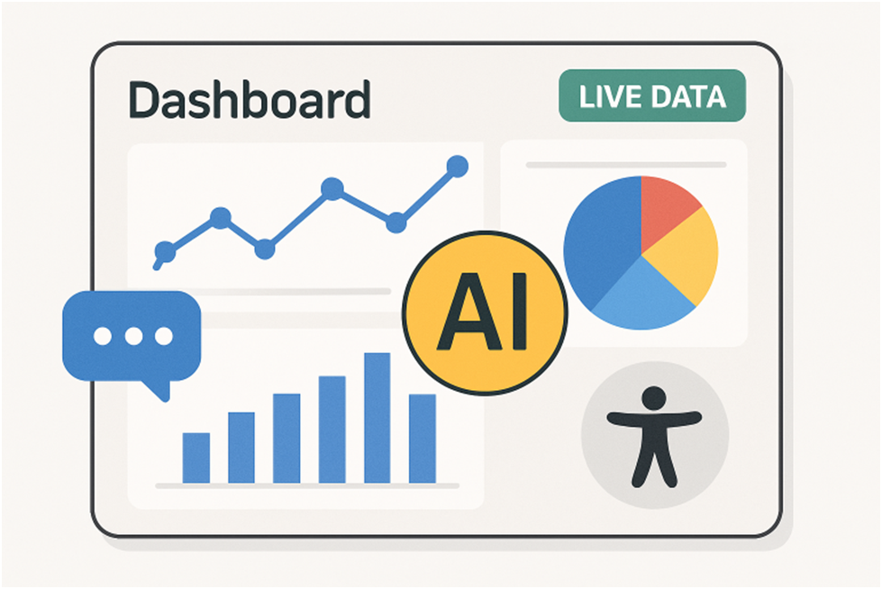
AI-Powered Insights
Artificial Intelligence (AI) is changing the way we visualise and interpret data. By integrating AI algorithms, dashboards can automatically surface insights, track anomalies, and convey complex trends in intuitive formats. Tools equipped with AI features, such as Tableau GPT and Power BI’s Copilot, mine large volumes of data in real time. They not only signal shifts and outliers, but also explain findings in everyday language—for example, notifying users of a “15% month-over-month increase in customer churn, mainly from Region X,” and suggesting targeted follow-up actions.
This capability accelerates decision-making and minimises errors linked to manual analysis. Automation frees up time for analysts while maintaining high standards of accuracy, making AI a vital tool in modern dashboard design. Learn more about AI-powered insights.
Real-Time Data Visualisation
Today’s leading dashboards feature real-time data visualisation, allowing organisations to monitor operations as they unfold. This immediate access to live key performance indicators (KPIs) is essential for sectors like logistics, finance, and e-commerce, where timing is everything.
Dashboard users now expect to adjust parameters and instantly see the impact. For example, tweaking fuel prices in a simulation can show immediate shifts in delivery timelines and costs, helping managers make quick, evidence-based decisions. Real-time dashboards also boost transparency, as multiple users view the same up-to-date information—reducing miscommunication and improving trust. Explore real-time data visualisation trends.
Immersive and Interactive Visualizations
Immersive technologies, such as Augmented Reality (AR) and Virtual Reality (VR), bring data visualisations into the third dimension, creating more engaging and memorable data experiences. AR tools like Microsoft HoloLens can superimpose interactive graphs and heatmaps onto the physical world—imagine a production manager “walking through” a holographic overview of current machinery performance on their factory floor.
Interactive dashboards don’t just display data—they invite users to explore it. Features like drag-and-drop filters, clickable drill-downs, and 3D pie charts let users personalise their journey, making complex datasets more approachable and actionable. This level of interactivity ensures users don’t just view data—they truly understand it.
Natural Language Processing Integration
Natural Language Processing (NLP) integration democratizes data analysis by enabling text or voice-based queries within dashboards. Instead of writing SQL queries or navigating complicated menus, business users can type or ask questions like, “Show last quarter’s sales by product line in Europe,” and receive instant visual responses.
Platforms like ThoughtSpot and Einstein Analytics harness NLP to translate queries into actions, making analytical insights accessible regardless of technical skill level. This removes barriers for non-technical stakeholders and accelerates the pace of insight discovery, ensuring that anyone can explore, customise, and understand the data within their dashboards.
Collaborative Data Exploration
Collaboration is an emerging pillar of effective dashboards. The newest generation of visualisation tools makes teamwork seamless: users can annotate insights, leave comments, and iterate on dashboards in real time, even remotely. Solutions blend visualisation, brainstorming, and feedback features, allowing multidisciplinary teams to converge around the same data narrative.
This collective approach ensures key stakeholders participate in defining insights and action plans, making data-driven decision-making faster and more inclusive. As organisations embrace hybrid and distributed work, collaborative dashboards break down silos and keep the entire team aligned.
Ethical and Accessible Design
Inclusive and ethical design principles are essential for modern dashboards. They must be accessible to all users, including support for screen readers and color-blind-friendly palettes, with clear alt text. AI dashboards need bias audits to prevent misleading visualization or recommendations. Transparency is key—users should understand how data is collected, processed, and visualized, with proper citations. Following accessibility and ethics ensures compliance, builds trust, and broadens impact. Future dashboards will incorporate AI insights, real-time analytics, immersive tech, NLP, and collaboration, making data experiences engaging, accessible, and actionable for all.