People sense a website before they fully read its content. In less than a second, visitors form an impression – deciding if the page feels organized or chaotic. This emotional response determines whether they stay or leave.
Web design creates these first impressions using geometric aesthetics like shapes, grids and alignment that guide the eye and organize information. The human brain feels at ease when it processes content in a structured, predictable way. Websites that use geometric design demonstrate intentionality, clarity, and professionalism – qualities a top Dallas web design agency specializes in delivering.
Geometric layouts make content easier to follow. Users can understand choices faster and perceive interactions as intuitive. In a digital world often overloaded with information, geometry provides clear visual cues that direct attention and create trust. A professional Dallas web design agency can implement these design principles to ensure your brand communicates effectively, enhances user experience and keeps visitors engaged.
Defining Geometric Aesthetics
Geometric aesthetics refer to the deliberate application of basic forms, shapes, contours, and network patterns to introduce order and significance to a digital interface. These aspects combine to generate a visual system that enhances transparency and movement.
In UI layout design, geometry functions like a blueprint. Grid-based design aligns content so eyes move smoothly from section to section. Lines separate ideas clearly. Shapes group related information into digestible blocks. Symmetry creates balance and emotional calm, while subtle asymmetry introduces energy and personality.
This structured approach strengthens visual hierarchy. Important content receives visual emphasis through size, placement, and spacing. The supporting information stays reachable while it matches the complete design structure. The user interface design achieves a spacious and confident look through minimalist style elements and proper geometric alignment, which protects user concentration.
Designers who rely on geometric shapes in web design understand human behavior. People process structured information faster. Faster understanding leads to comfort. Comfort leads to trust.
Common Geometric Elements Used in Web Design
Geometric design appears across digital experiences in ways that feel intuitive rather than decorative. Each element plays a specific role in shaping user perception.
Circles
Circles communicate warmth, continuity, and connection. Designers often use them for profile images, icons, progress indicators, and feature highlights. In user experience design, circular elements draw attention gently and create emotional softness. They invite interaction while maintaining visual harmony.
Triangles
Triangles bring direction and movement. They guide the eye and introduce momentum into layouts. Many hero sections rely on triangular compositions to guide attention toward headlines or calls-to-action. Their angular nature adds energy while maintaining structure.
Lines
Lines provide clarity and flow. Horizontal lines divide sections smoothly. Vertical lines organize navigation and content columns. In UI layout design, lines help users scan information efficiently and understand relationships between elements.
Patterns
Geometric patterns add texture and depth. Repeating shapes can enrich backgrounds while keeping the interface clean and readable. Patterns contribute personality while supporting consistency.
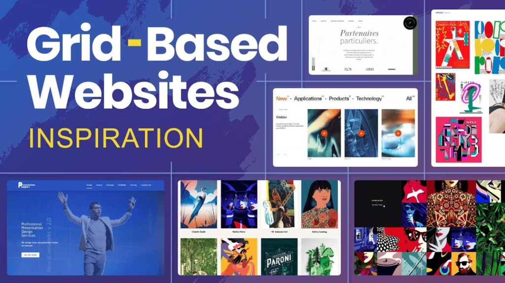
Grids and Modular Layouts
Grid-based design forms the foundation of modern websites. The grid system maintains device alignment and produces consistent visual patterns. This produces rhythmic elements across all screen types.
Websites that use modular grid-based layouts will adapt their content presentation when their content volume expands. Web design achieves natural user experiences through the combination of these geometric shapes in web design, which produce clear interfaces with balanced structures, and functional designs.
Why Geometric Aesthetics Are Trending Right Now
Simplicity and Minimalism
Digital environments demand attention constantly. Users seek clarity and breathing space. Minimalist web design, supported by geometry, answers this need. Clean layouts reduce mental effort and allow users to focus on essential content.
Geometry makes simplicity possible. It removes visual clutter while preserving structure. When layouts feel clear, reading becomes easier. Easier reading encourages deeper engagement and stronger trust.
Strong Visual Identity
Brands benefit from recognition and consistency. Geometry helps build visual systems that remain recognizable across platforms. Shapes, spacing, and alignment become part of a brand’s visual signature.
Geometric systems translate well across websites, apps, presentations, and marketing assets. Over time, users associate these patterns with reliability and professionalism, strengthening digital branding.
Influence of Modern Digital Design Trends
Daily interactions with apps, dashboards, and platforms shape expectations. People need clear information which must follow logical patterns to achieve efficient operational results. The modern UI trends for user interfaces show modular layouts together with organized system structures, which fulfill these requirements.
The modern design style works perfectly with the contemporary design language which designers use. They present themselves as modern while maintaining their naturalness and their meaningfulness. The known elements in the environment help people develop their emotional comfort, which leads to their self-assurance.
Compatibility With Responsive and Mobile Design
The structure of a system determines how it will react to various situations which it encounters. The shapes maintain their original form when you change their size. Grids adapt smoothly. Designers use responsive design aesthetics to achieve balance and hierarchy. This stays consistent throughout different screen dimensions.
Fluid grids together with adaptive layouts maintain identical visual presentation on all devices, which include phones, tablets, and desktop computers. Designers use geometry to create
How Geometric Aesthetics Improve User Experience (UX)
Enhancing Visual Hierarchy
People scan pages instinctively. Geometry supports this behavior by guiding attention. Shapes frame sections. Alignment creates rhythm. Size and spacing communicate importance.
Strong visual hierarchy in web design helps users understand content quickly. Clear structure reduces hesitation and creates confidence during navigation.
Strengthening Calls-to-Action
Buttons, icons, and badges gain clarity through geometry. Rounded shapes feel approachable. Angular shapes convey urgency and focus. Consistency across interactions builds familiarity and trust.
These design cues support engagement and improve interaction rates in a natural, respectful way.
Improving Content Organization
Complex information becomes approachable through geometric organization. Card layouts group related ideas. Section dividers create pauses for comprehension. Modular sections support storytelling and logical flow.
When geometry aligns with proven UX design principles, interfaces feel predictable and comforting. User-friendly layouts encourage exploration and reduce decision fatigue.
Best Practices for Designing With Geometric Elements
Balance Simplicity and Creativity
Geometry thrives in balanced environments. Thoughtful restraint allows shapes to communicate clearly. Designers often select a limited set of shapes and repeat them intentionally across the interface.
Minimalist aesthetics give geometry space to breathe and maintain visual clarity.
Maintain Consistency
Consistency builds confidence. Shape styles, spacing, and alignment should follow a defined system. Predictable patterns help users learn navigation effortlessly.
Design systems rely heavily on geometry to maintain cohesion across pages and components.
Use Color Strategically
Color enhances geometry when applied thoughtfully. Contrast draws attention to key actions. Harmonious palettes support brand identity. Understanding color psychology in UI allows designers to guide emotion gently and purposefully.
Consider Accessibility
Inclusive design creates better experiences for everyone. Clear contrast ratios, readable typography, and thoughtful spacing support design accessibility. Geometry improves web usability when it respects diverse needs and abilities.
Industries Where Geometric Aesthetics Work Best
Tech and SaaS
Technology platforms benefit from structured clarity. Geometry communicates efficiency, intelligence, and innovation. Clean layouts help users understand complex tools with ease.
Creative Agencies and Portfolios
Creative professionals use geometry to frame expression with structure. Shapes guide storytelling while allowing individuality to shine. This balance offers endless creative website inspiration.
eCommerce
Product-focused experiences rely on clarity. Grid systems keep attention on products and simplify browsing. Geometry supports comparison and decision-making.
Corporate and Professional Websites
Trust matters deeply in professional environments. Structured layouts and balanced visuals reinforce credibility. Geometry strengthens brand identity design and consistent digital branding.
Real-World Examples of Geometric Web Design Done Right

Many successful digital platforms rely on geometry quietly. SaaS products use card-based grids to simplify workflows and dashboards. Creative studios frame narratives with bold shapes and thoughtful spacing. eCommerce brands depend on consistent grid systems to create smooth browsing journeys.
In each case, shape language supports both usability and brand expression. These platforms offer strong website design inspiration, present polished modern website examples, and function as compelling UI design showcases where form and function coexist beautifully.
The Emotional Side of Geometric Design
Beyond structure and usability, geometry influences emotion. Balanced layouts feel calming. Repetition feels reassuring. Predictable spacing creates a sense of safety. Users feel guided rather than rushed.
When visitors feel comfortable, they stay longer. They read more. They explore deeper. Geometry creates emotional trust through order and rhythm. This emotional layer often matters as much as visual appeal.
Geometry and Long-Term Design Scalability
Websites grow over time. New pages appear. Content expands. Features evolve. Geometry supports growth gracefully. Grid-based systems allow teams to add sections while preserving consistency.
Scalable design saves time, reduces confusion, and protects brand integrity. Geometry offers a foundation that grows alongside the business.
Conclusion
Geometric aesthetics work because they align with how humans see, think, and decide. Structure creates clarity. Clarity builds confidence. Confidence leads to action. When geometry supports brand voice and user goals, it becomes a lasting design foundation, something AdvancEdge Digital consistently applies in its projects to help brands connect meaningfully with their audience.
A thoughtful website redesign strategy uses geometry to guide attention and build trust. Structure should support stories, relationships and growth. Following modern web design best practices, AdvancEdge Digital ensures that geometric design feels timeless, calm and deeply human while reinforcing each brand’s unique identity.